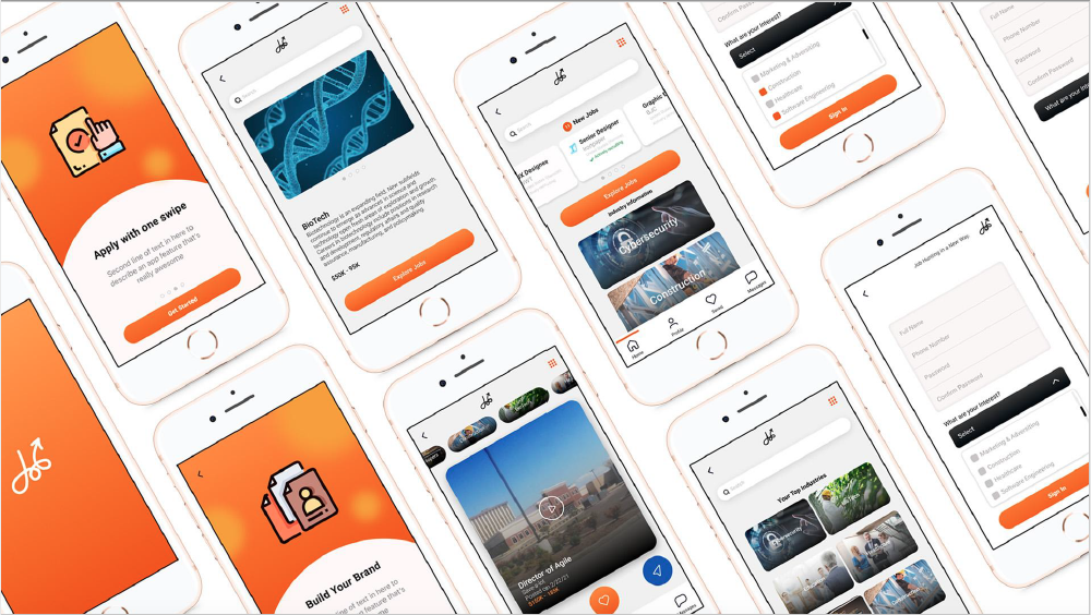
Find your next job with your personal brand.

A Job App matching you with meaningful 
companies with one swipe.

"Job hunting is a job... lets make it easier"

Origins

In the begin of this process, I was in the midst of losing a job and at the same time looking for a new meaningful career. The origins of this project started in the middle of a global pandemic which made me focus on this new emerging workforce.

Overview

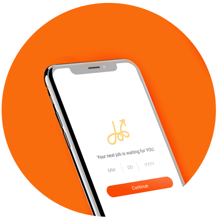
After 24 weeks, I decided to move forward with developing a job app concept called JopUp. Although this is a concept, there were real challenges to solve and research. My idea has taken me in various direction and continue to change as the landscape transforms daily. Seeking to take this idea to the next level, I use the Design Thinking process which, allowed me to develop an application for job seekers of all backgrounds who use mobile devices to apply to jobs. This job app will use friendly social engagement features to connect you and your personal brand to hiring managers at the beginning of the hiring process.

Challenge

Before the COVID-19 Pandemic, applying for a job was a long process and still is a long process. Studies show that more than half of job seekers quit the application process due to its length and complexity. The application process is not really mobile-friendly. There are job apps and social media platforms that do address the time and complexity of applying to jobs. But talking to various people, there are opportunities that need to be explored. My solution seeks to design a better user experience for mobile device job seekers on a journey to find their next joyful opportunity.
My Role

> Researcher
> UX Designer
> Visual Design
> Brand Strategist

My Focus

> Research
> Wireframing
> User Interface Design
> Prototyping

Tools

> Figma
> Adobe Photoshop
> Adobe Illustrator
> Miro

Partipants

> classmates
> Friends
> family
> colleagues

My Process

I used the Design Thinking process which, allowed me empathize with potential users and develop my ideas fast.

understanding the landscape

Empathizing with the user is very important. The first step I wanted to take was to talk with different in the search for new job opportunities. My goal was to see if people use mobile job apps as part of their process and what frustrated them the most. The mobile job app landscape is healthy with several options for user to download. This there any room to improve the experience?

strengths

Multiple job search topics pre arranged for you to click.

Weaknesses

Easy to read content

Strengths

Great branding and key messaging with opening screen.

Weaknesses

No career information that helps users to improve their career.

Strengths

Networking platform that allows you to connect with other coworkers or hiring managers/recruiters

Weaknesses

Content overload

Strengths

Filter User Interface (filtering your search)

Weaknesses

Hard to find resources for the job seeker

Interview the user

I interviewed several job seekers to determine their pain points, needs, and feelings in preparation for looking for a job and during the hunt for meaningful employment. I interviewed 7 individuals with very different backgrounds with a goal to under their needs and frustrations.

Questions: What’s your relationship like with hiring managers and/or recruiters? How do you currently go about hunting for new work/job opportunities? How much time do you typically spend on applying to jobs? Tell me about the last time you applied to a job online? What is the biggest pain point for you related to job hunting on and offline?

Needs and Wants

  • Users wanted to be able to apply quickly on mobile.
  • Users want to connect human to human with the hiring staff.
  • Users need an app that helps them find a career that is meaningful.

Frustrations

  • Resume Upload
  • Company Websites
  • Job App Functionality

Unique and non-traditional job seekers

Talking with different people with different experiences opened my eyes to the job hunt journey. Each person has a unique path to job security for themselves and their families. After interviewing several unique individuals, I crafted 3 personas.
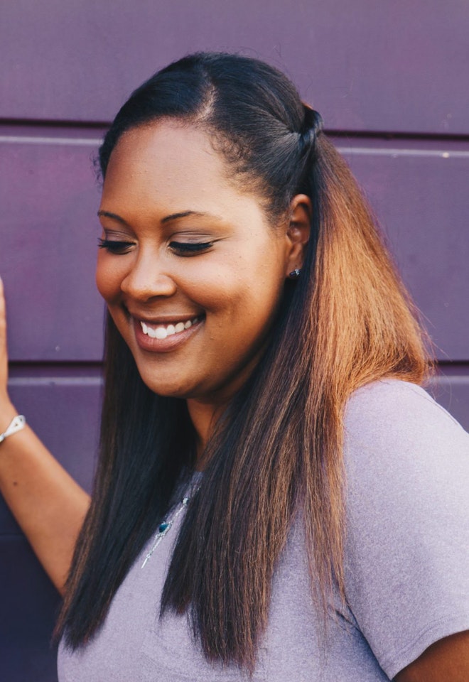
Ashley Hall

Age
Occupation
Education
Status

30
Health Consultant
MHA
Single

Background

Ashley recently started a new job as a Telehealth Navigator in a virtual hospital. She has recently moved to Saint Louis with her sister and is not familiar with all the job opportunities this City has to offer. He’s excited to bring a young and new perspective to his next job. Kwame enjoys cooking, music, and spending time painting friends and family. 

Personality

  • Extrovert
  • Cares about others 
  • Go Getter

frustrations

  • Feeling discriminated against
  • Years of experience
  • Applying to external jobs(the process)
  • The waiting game
  • Feeling discriminated against
  • Years of experience
  • Applying to external jobs(the process)
  • The waiting game

Brands

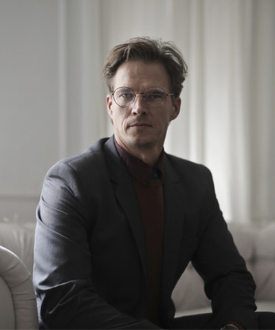
Frank lumumba

Age
Occupation
Education
Status

25
Student
Business Administration
Single

Background

Frank recently graduated from a small male college in central Missouri. He just moved to Saint Louis and is not familiar with the City nor the people. He’s excited to bring a new perspective to his next job. Frank enjoys cooking, making music, and spending time painting pictures of friends and family. 

Personality

  • Introvert
  • Creative
  • Empathize with others

frustrations

  • Cultural bias
  • Years of experience
  • Applying to external jobs(the process)
  • The waiting game for international workers

Brands

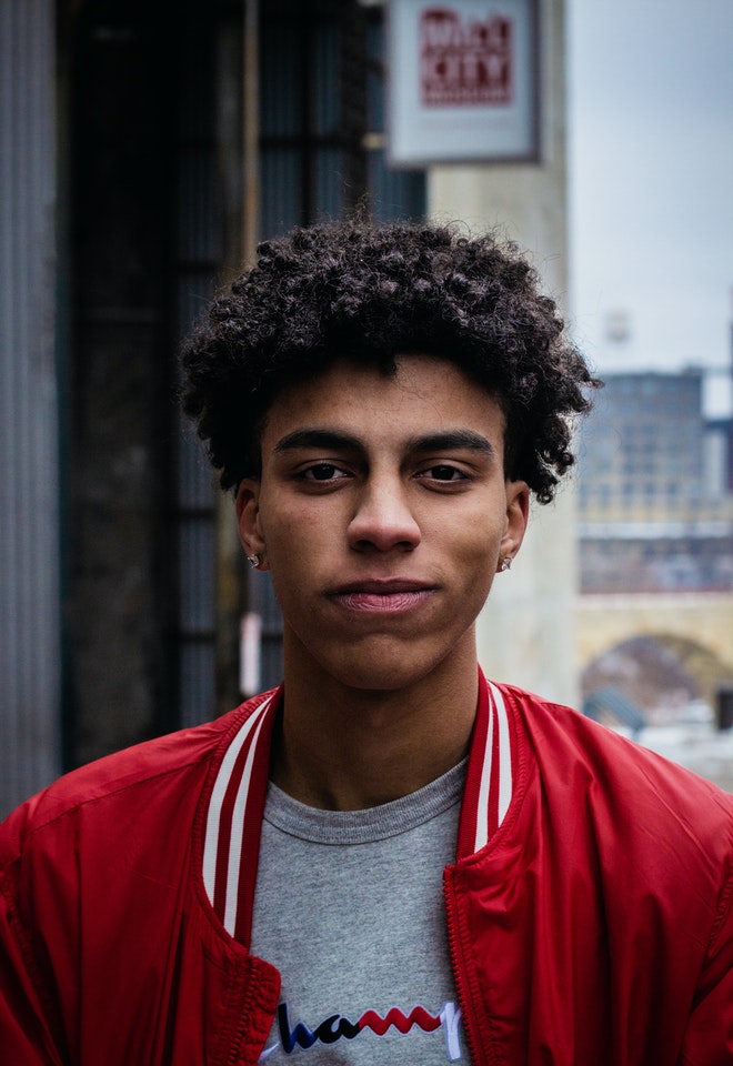
Derrick Miles

Age
Occupation
Education
Status

42
Manager
Mathematics
Married

Background

Derrick lost his job as a PMO Director for a national grocery store. He has been working in the corporate world for the past 20 years and recently moved to Illinois with his family. Outside of the work, Derrick enjoys DIY projects, traveling with his family, and spending time helping people develop strong leadership skills. 

Personality

  • Super Extrovert
  • Humble 
  • Driven
  • Authentic

frustrations

  • Role opportunities
  • Age
  • Interview Process

Brands

Storyboarding

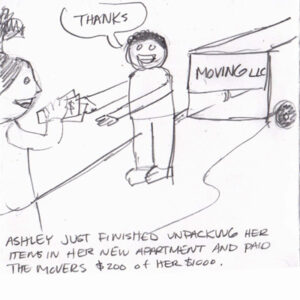
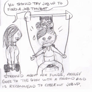
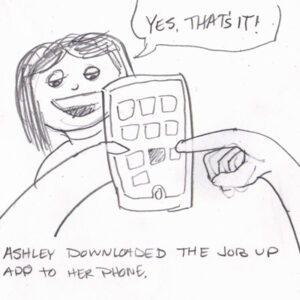
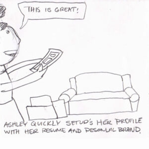
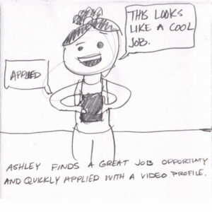
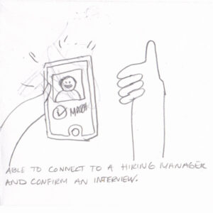
In order to better understand this product, I must understand what’s going on in the user’s world and understand how this product can make the user’s life better. As part of this phase, I decided to sketch a storyboard for one of my users.

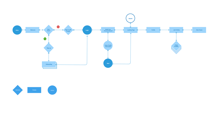
User Flow

Information Architecture helped me understand user journey

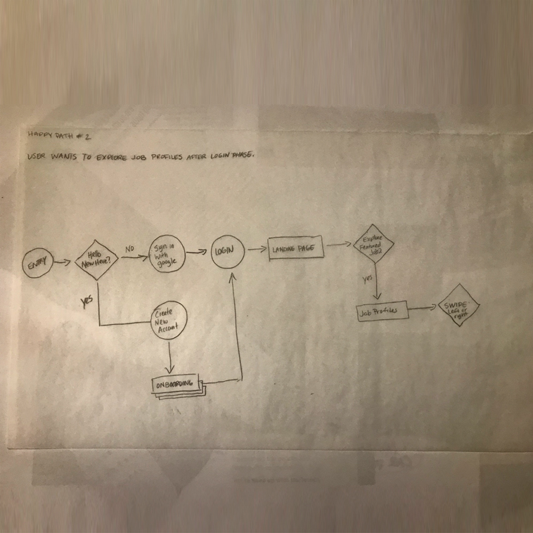
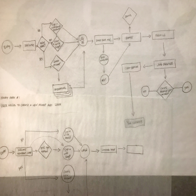
I want to explore the best user flow and worked on a few happy path before landing on the final version. Click below to view in Figma.

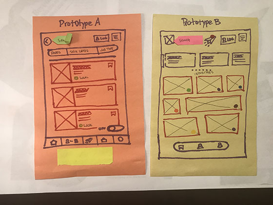
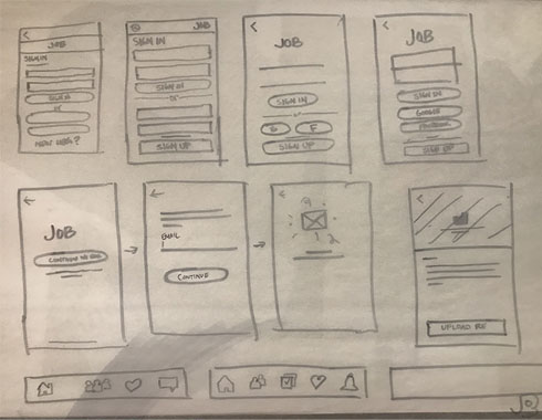
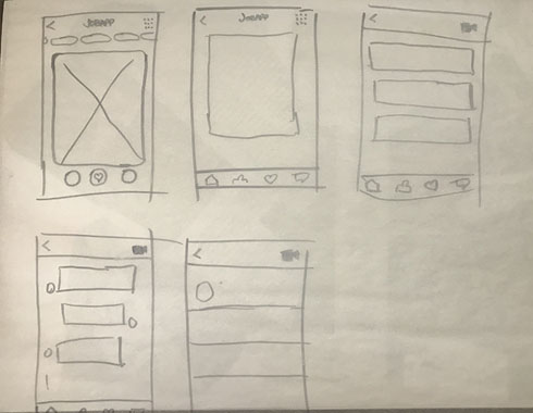
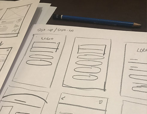
Thinking on paper

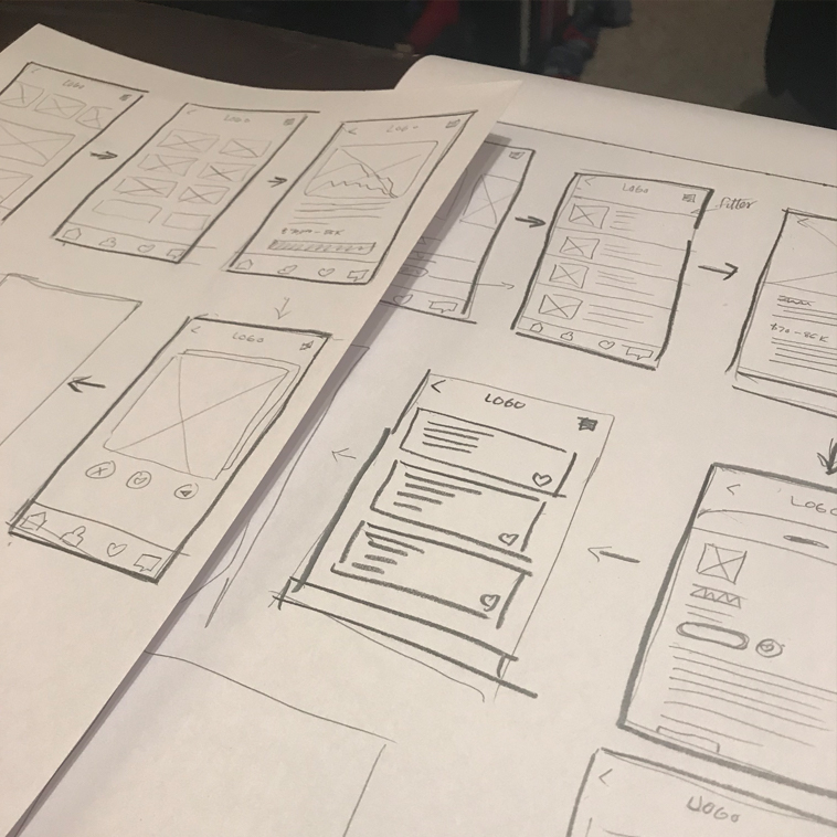
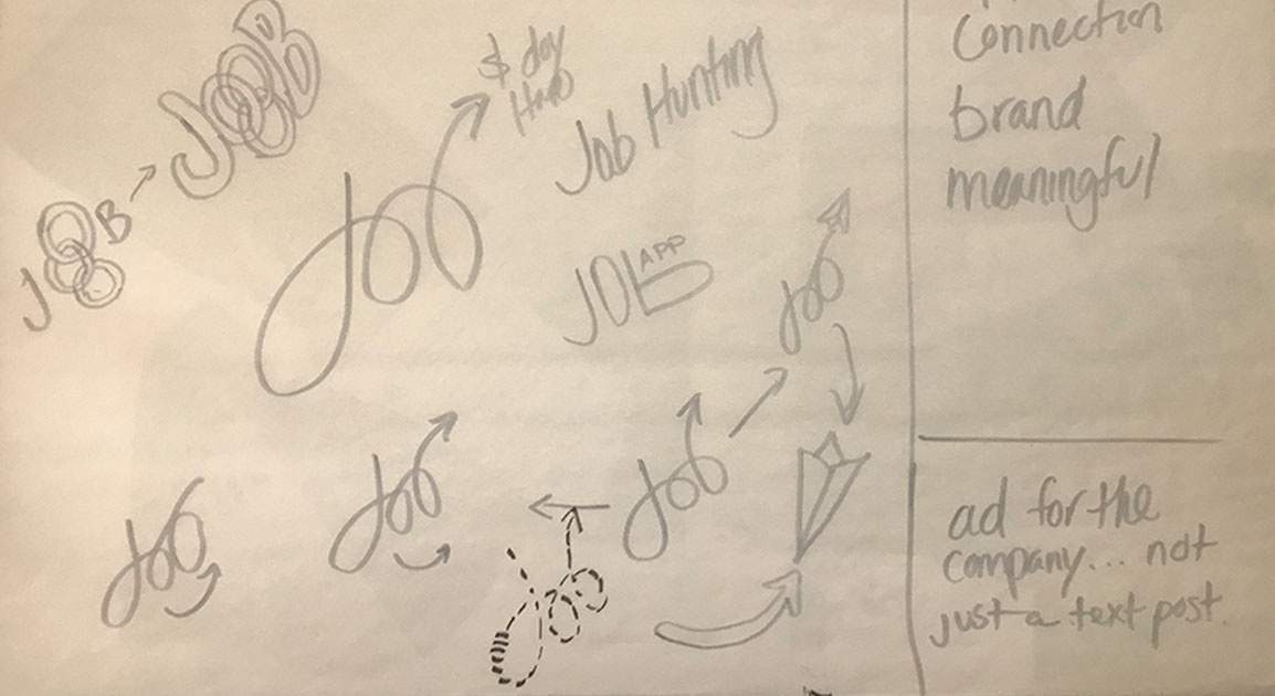
Paper prototyping is a crucial part of the early UX design thinking. This process allowed me to collaborate with others to explore lots of ideas.

Paper Prototyping

Take a peek inside how I think

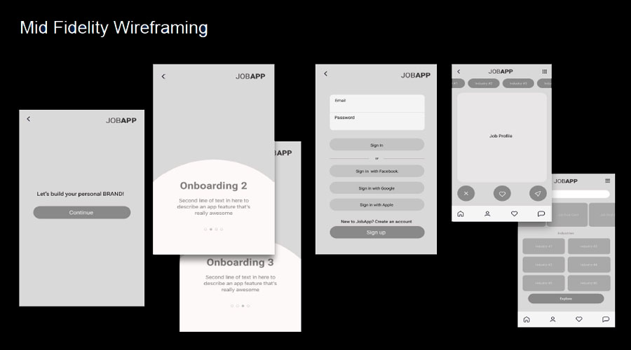
Low Fidelity unmoderated usability testing

Brand Identity

Color Scheme

Black

HEX: 000000

SunRa Orange

HEX: f84d05

Old Gold

HEX: Faa71a​

Click Picture to view in Figma

Thanks for viewing